Why You Should Start Using Procreate: The Ultimate Digital Art App for Creatives

Procreate is a powerful and versatile digital art app that offers a wealth of features and tools for artists of all levels. Whether you’re a professional artist, hobbyist, or just starting out, Procreate has something to offer everyone. In this blog post, we’ll explore some of the reasons why you should start using Procreate and what makes it a must-have tool for creative professionals.

  1. Intuitive User Interface

One of the biggest advantages of Procreate is its intuitive and user-friendly interface. The app is designed to make it easy for artists to get started and to quickly create professional-looking artwork. All of the tools are organized in an easy-to-navigate manner, making it simple to find what you need when you need it. The interface also includes customizable gestures and shortcuts, allowing you to streamline your workflow and work faster.

  1. Wide Range of Tools and Brushes

Procreate offers a vast selection of tools and brushes, including pencils, pens, watercolors, and more. Each brush is highly customizable, allowing you to adjust the size, opacity, and pressure sensitivity to create the exact look you’re after. Whether you’re working on fine-tuned details or large, sweeping strokes, Procreate has the tools to get the job done.

  1. High-Quality Output

Procreate is designed to deliver high-quality output, no matter what type of artwork you’re creating. With support for up to 8K resolution and an advanced color management system, you can be confident that your artwork will look stunning and professional. Procreate also supports multiple file formats, making it easy to export your artwork for use in other applications or for print.

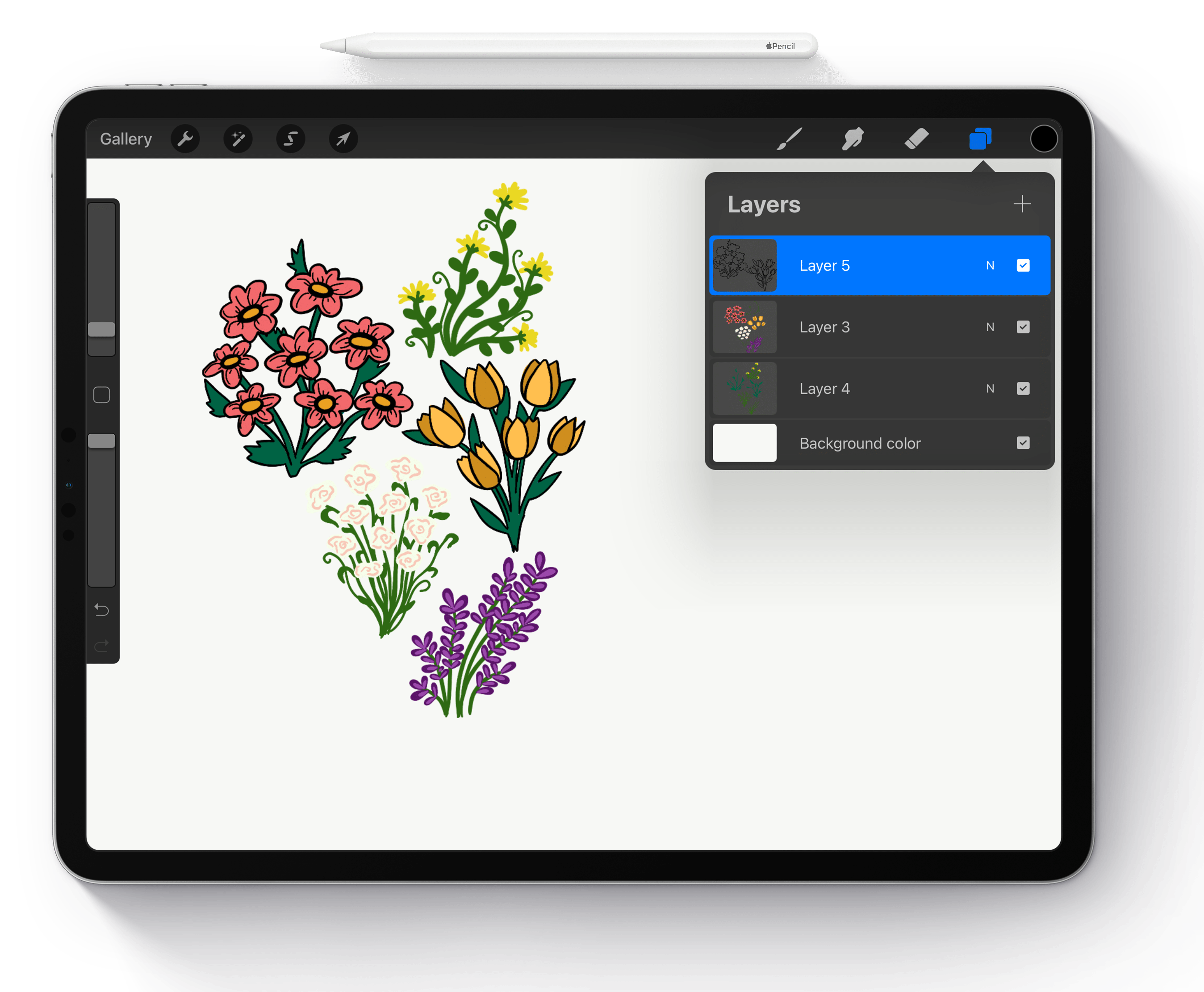
  1. Advanced Layers System

Procreate’s advanced layer system allows you to work with multiple layers in your artwork, making it easier to create complex compositions. Layers can be moved, duplicated, merged, and more, giving you complete control over your artwork. The layer system also makes it easy to create non-destructive edits, allowing you to make changes without affecting your original artwork.

  1. Time-Lapse Recording

Procreate’s time-lapse recording feature is a fun and engaging way to share your creative process with others. With this feature, you can record your artwork being created in real-time, and then share the time-lapse video with others. This is a great way to showcase your skills and to give others a glimpse into the creative process behind your work.

In conclusion, Procreate is a powerful and versatile digital art app that offers a wide range of features and tools for artists of all levels. Whether you’re a professional artist, hobbyist, or just starting out, Procreate has something to offer. So why not download the app today and start exploring all the amazing features and tools that Procreate has to offer!
Surface Pattern Design: A Guide to Creating Beautiful, Repeatable Textile Designs

Surface pattern design is the art of creating repeating patterns for textiles, wallpaper, wrapping paper, and other products. These patterns can range from simple geometric shapes to complex illustrations and can be used to add visual interest and texture to a variety of products.

The process of creating a surface pattern design typically begins with a concept or inspiration. This could be anything from a particular color scheme to a botanical illustration. From there, the designer will sketch out their ideas and refine the concept until they have a clear vision for the final design.

Once the concept is solidified, the designer will then create a repeatable pattern by arranging the design elements in a way that allows for seamless repetition. This process can be done by hand or with the aid of digital design software such as Adobe Illustrator or Procreate.

When creating a surface pattern design, it’s important to consider color, scale, and balance. Choosing the right color palette can greatly impact the overall look and feel of the pattern, while considering scale will ensure that the design elements are proportionate and visually appealing. Balance is also key, as a well-balanced pattern will look harmonious and professional.

It’s also important to think about the intended use of the surface pattern design. For example, if the pattern is to be used on clothing, it may need to be scalable and flexible to accommodate different garment sizes. On the other hand, if the pattern is intended for wallpaper, it may need to be more detailed and intricate to hold up at larger sizes.

When creating surface pattern designs, it’s also important to consider the end product. Different printing techniques, such as screen printing or digital printing, will affect the final look of the design, so it’s important to keep this in mind and make adjustments as needed.

In conclusion, surface pattern design is a creative and rewarding field that allows designers to bring their ideas to life through the creation of beautiful, repeatable patterns. Whether you’re a seasoned designer or just starting out, the key to success is to have a clear concept, think about the intended use, and pay attention to details like color, scale, and balance. With practice and dedication, anyone can create stunning surface patterns that will add beauty and texture to a variety of products.

An Introduction to Color Theory For Painters

Color is a very broad topic. Entire books have been written on color and it would be quite difficult to cover every aspect of it within the confines of this article. My hopes with this introduction to color theory is to peek your interest and hopefully cause you to study this topic further on your own. Understanding color theory is perhaps one of the most important aspects of becoming a good painter. When you understand the elements of color and how colors interact with one another, you have unlocked one of the biggest puzzles of painting.

WHERE DOES COLOR COME FROM?

Our beautiful world of color is only possible because of the solar spectrum. You can certainly do your best to mimic natural sunlight with today’s technology and they have done a pretty fine job of that with full spectrum lighting. But even full spectrum lighting is not as true as sunlight. One only needs to spend a day painting outdoors to see how your color pops out at you under natural sunlight when compared to indoor lighting.

So what exactly makes a rose appear “red” or grass appear “green”. In the green grass, you are only seeing green because the grass has pigments in it that absorb all colors of the solar spectrum except green. So green is the color that is reflected back to your eyes. The same holds true for the red rose, only the rose absorbs all colors of the spectrum besides red.

THE COLOR WHEEL

Sir Issac Newton laid the foundation for today’s color wheel with his experiments that began in 1666. Since then, many variations have been developed. A color wheel is essentially a diagram that represents the colors of the visible solar spectrum. Your basic color wheel consists of six colors: red, orange, yellow, green, blue and violet.

Another popular color wheel called the Munsell color wheel, is slightly more involved. Instead of 6 basic colors, the Munsell wheel consists of ten colors: red, yellow-red, yellow, yellow-green, green, blue-green, blue, blue-violet, red-violet and violet.

PRIMARY COLORS

The primary colors are red, yellow and blue. These colors are your base colors from which all other colors come from.

SECONDARY COLORS

When you mix two primary colors together, you get a secondary color. The secondary colors are orange, green and violet. Orange is made by mixing red with yellow. Green is made by mixing blue and yellow. Violet is made my mixing blue with red.

TERTIARY COLORS

Tertiary colors are made by mixing one primary color with one secondary color. For instance, mixing the primary color blue with the secondary color green, will give you a tertiary color called blue-green.

COMPLIMENTARY COLORS

These are colors that are opposite from one another on the color wheel. Red and green, blue and orange, yellow and violet, are examples of complimentary colors. Complimentary colors are colors of extreme contrast. When used together in a painting, they can produce brilliant vibrant images.

ANALOGOUS COLORS

Analogous colors are colors that are close to one another on the color wheel. They more or less will produce harmonious effects with very little contrast. For instance, a violet, red-violet, and blue-violet are examples of analogous colors.

HUE-VALUE-INTENSITY

Hue: Without getting too technical, and to put things into laymen’s terms, hue is just another word for color. For instance, grass and leaves are two variations of a green hue.

Value: Value refers to how light or dark a color is. Colors like pink or aqua are identified as colors of high value. Colors like maroon and navy are identified as colors of low value. If you produce a painting with predominately higher values, the painting is referred to as a “high key” painting. On the contrary, paintings produced with predominately lower values, are referred to as “low key”.

Intensity: Intensity refers to a colors brightness or saturation. Intensity refers to how pure a color is. For instance, if you were to use cadmium red straight from the tube, it would have a high intensity. If you were to mix it with another color however, its intensity would be diminished.

TEMPERATURE OF COLOR

Colors have temperature, referred to as warm or cool. In painting, reds, yellows and oranges are referred to as warm colors and blues, violets and greens are referred to as cool colors. One of the biggest lessons you will ever learn about color temperature though, is that the appearance of color can change drastically depending on its surroundings. For instance, a certain yellow would appear much hotter if it were surrounded by a violet then say an orange. Another important lesson in color temperature: Warm colors will advance in a painting and cool colors recede.

Article Source: https://EzineArticles.com/expert/Ralph_Serpe/18025

OH HEY

looking for something?

© 2019-2023 Amanda McCarty Design. All Rights Reserved.